As part of their 2026 strategy, York St John University set themselves an ambitious challenge to change the expectations of what a university should look, sound and feel like, moving away from a traditional institution to a brand which empowers every student that studies there.
Renowned for our portfolio of diverse and unique university websites, York St John approached Absolute to help deliver a visually stunning website, which was not only inclusive, but future-focused too. To achieve this, we looked at the brand and messaging first to make sure we had the right assets to help create and build their main recruitment tool.
The Insight
Collaboration, for Absolute, is key to a successful digital transformation project. Working closely with York St John, we ran internal Absolute Clarity workshops with the students and marketing team to gain the valuable insights we needed. We openly discussed user experience, content structure and creative direction, which gave us a clear vision and helped us to set goals for the new website.
The Idea
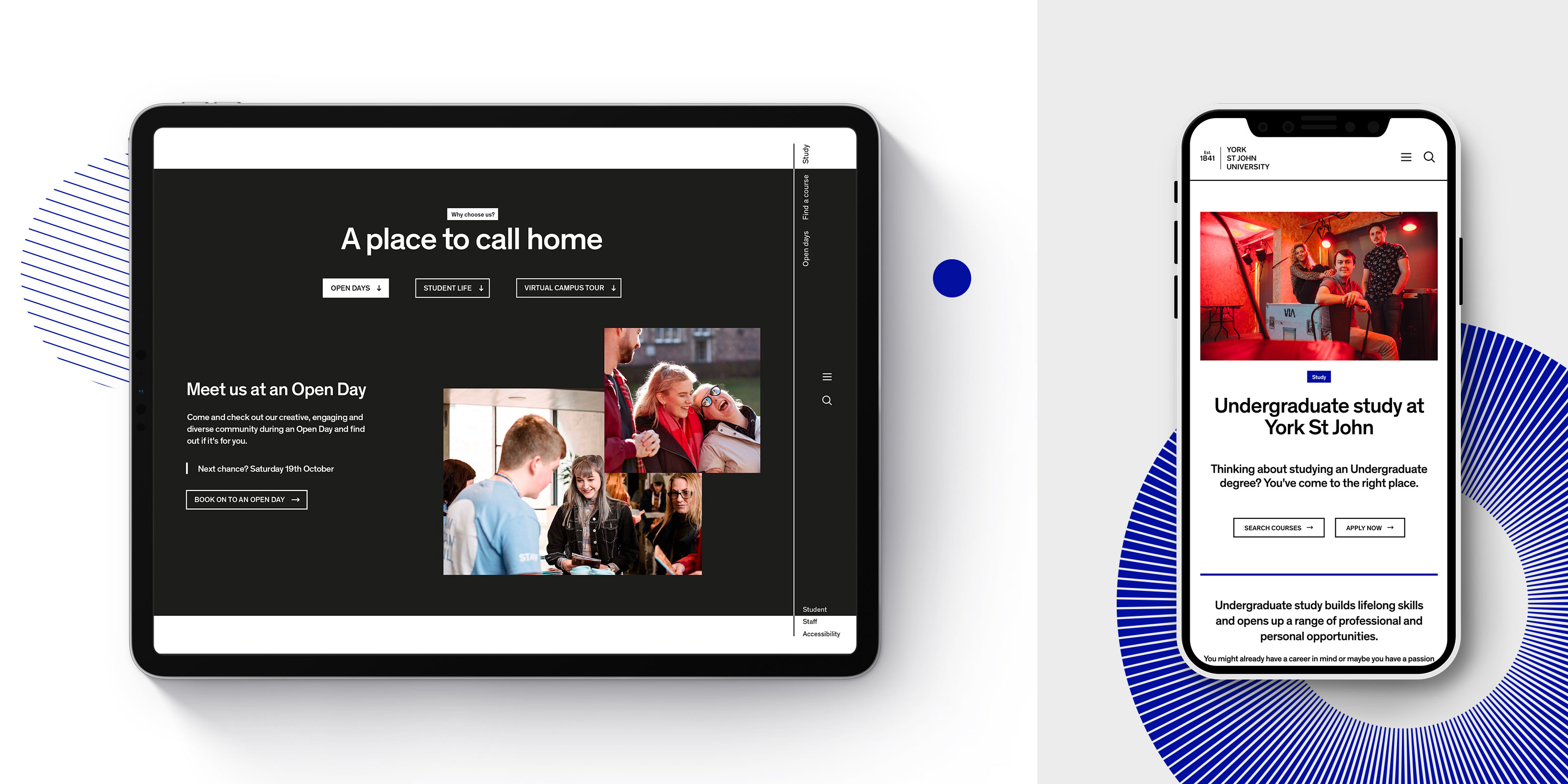
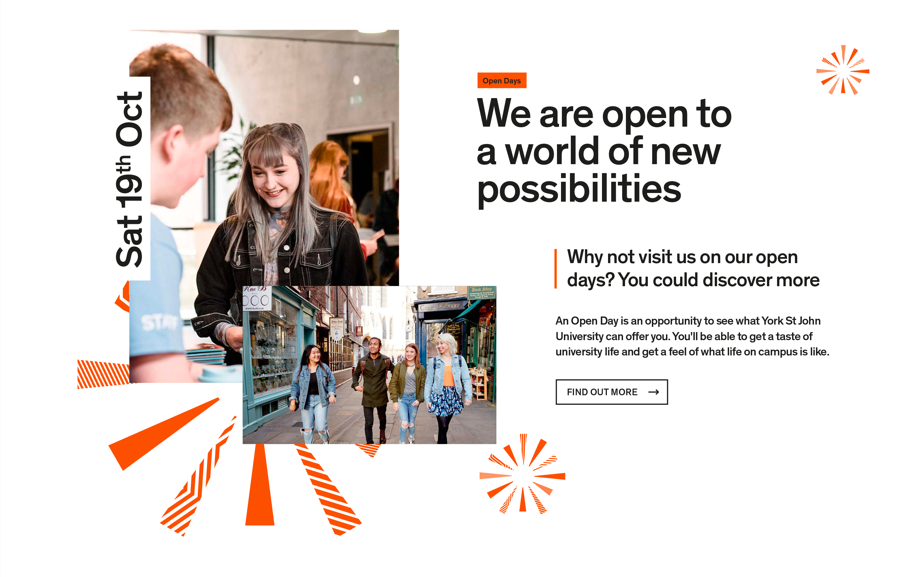
From the start, our ambition was to deliver a university site which was brave enough to challenge the expected higher education website experience, predominantly taking inspiration from the fashion and lifestyle sector. Working with our newly created brand assets, we were able to bring to life the black and white style with our colourful animated patterns and warm, diverse lifestyle imagery.
The Delivery
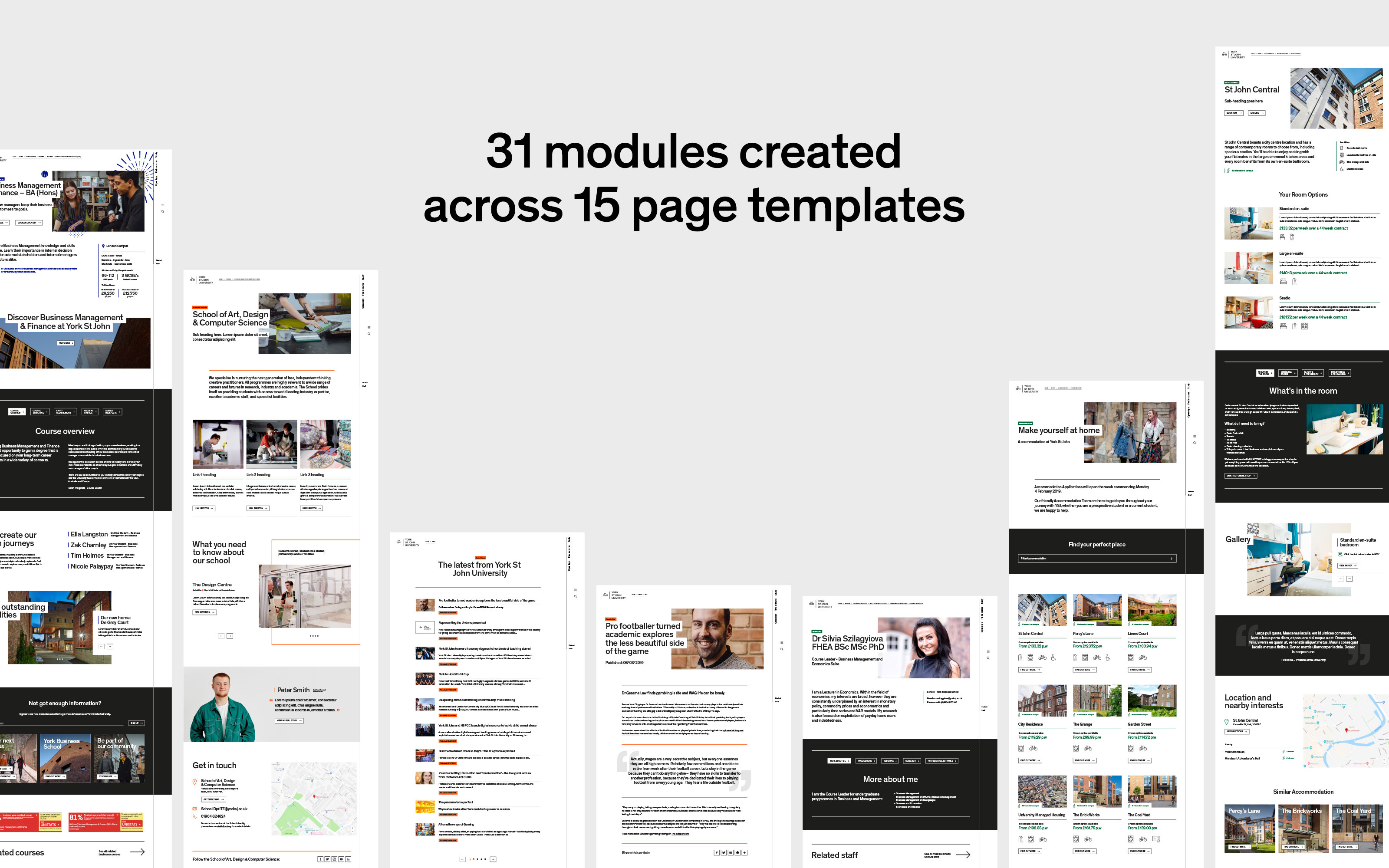
Working closely with the York St John digital team our role was to implement the front end designs into their TerminalFour CMS. One of our key objectives was to give their team the ability to update specific areas within pages without losing the integrity of the design. This is where our Absolute Control pattern library became a key part of the build system. We created different module layouts, that could be added or removed, so that it allowed the pages to be flexible enough for change without losing the integrity of the user interface. A total of 31 components and content types were initially delivered for the launch of the new site, with the flexibility for new components to be designed and implemented when they're needed.
The navigation was also a focus point, breaking HE conventions and eradicating the use of a large block header and mega menus of days gone by. Due to the scale and wide-reach of the university sitemap, we outlined key requirements that needed to be met. We set out early to design and prototype concepts to test with students. Developing their preferred concept and continuing to test and refine the user experience along the way.
The Result
The success of the agile delivery and collaboration between agency and university allowed the first rollout of the new designs on key landing pages to be made three months ahead of schedule.


