When at rest, the red-eyed tree frog’s vibrant green body blends seamlessly into the surrounding jungle foliage, providing natural camouflage from predators. However, if threatened, it snaps open its bright red eyes, startling its aggressor and buying time for a swift escape. This behaviour, known as Deimatic Behaviour, contrasts with aposematism — a defensive strategy where organisms display an "always-on" colour to signal danger. Examples include widow spiders, coral snakes, ruby bonnets, and fly agarics.
An intriguing evolutionary aspect of the frog's red coloration ties into human vision. Like many primates, humans have evolved trichromatic vision, meaning our eyes can detect three primary colours: red, green, and blue. Our retinas contain three types of cone cells: L-cones (sensitive to long wavelengths, i.e., red), M-cones (sensitive to medium wavelengths, i.e., green), and S-cones (sensitive to short wavelengths, i.e., blue).
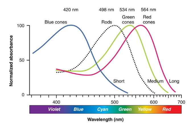
L- and M-cones, which detect red and green, are much more abundant than S-cones, which detect blue. This means we perceive red and green more quickly and clearly than blue. From an evolutionary standpoint, this makes sense: one theory suggests that trichromatic vision helped our ancestors identify ripe fruits, which often turn red or orange.
Red is also tied to social signalling. It’s linked to blood and skin colour changes, which can indicate emotional states like anger or blushing. This could have been useful for social communication and survival. Additionally, red is often associated with danger — from fire to poisonous animals. This natural association likely prompted faster reactions to potential threats. It’s no coincidence that we use red in modern warning signs — nature has ingrained this response in us. Today, though, the threats our trichromatic vision helps us identify are more likely to be financial crashes than attacking predators.
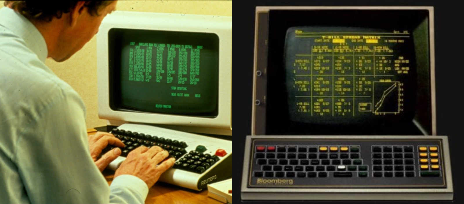
The first financial trading terminals, developed by Reuters in the early 1970s, used a simple dual-colour scheme: green on black. When Bloomberg launched in 1982, they opted for a yellow interface to differentiate themselves. Their market dominance quickly followed, and as technology improved, more colours were introduced. However, the black background remained a staple.
This legacy black meant that blue could not be used for critical information, and red was adopted alongside green to signify price movements. Most designers are familiar with the expression “Red and green should never be seen” — and for good reason. These colours can cause an optical effect known as Optical Vibration. Colours opposite each other on the colour wheel, like red and green, blue and orange, or yellow and purple, create the highest contrast. When placed next to each other, they cause a visual tension, making them appear to "vibrate" or shimmer.

Bloomberg has had to fine-tune its interface colour hues to address this issue, with varying degrees of success. There may eventually be a future where Bloomberg introduces a full light mode and swaps green for blue, but one thing is certain — red is here to stay.
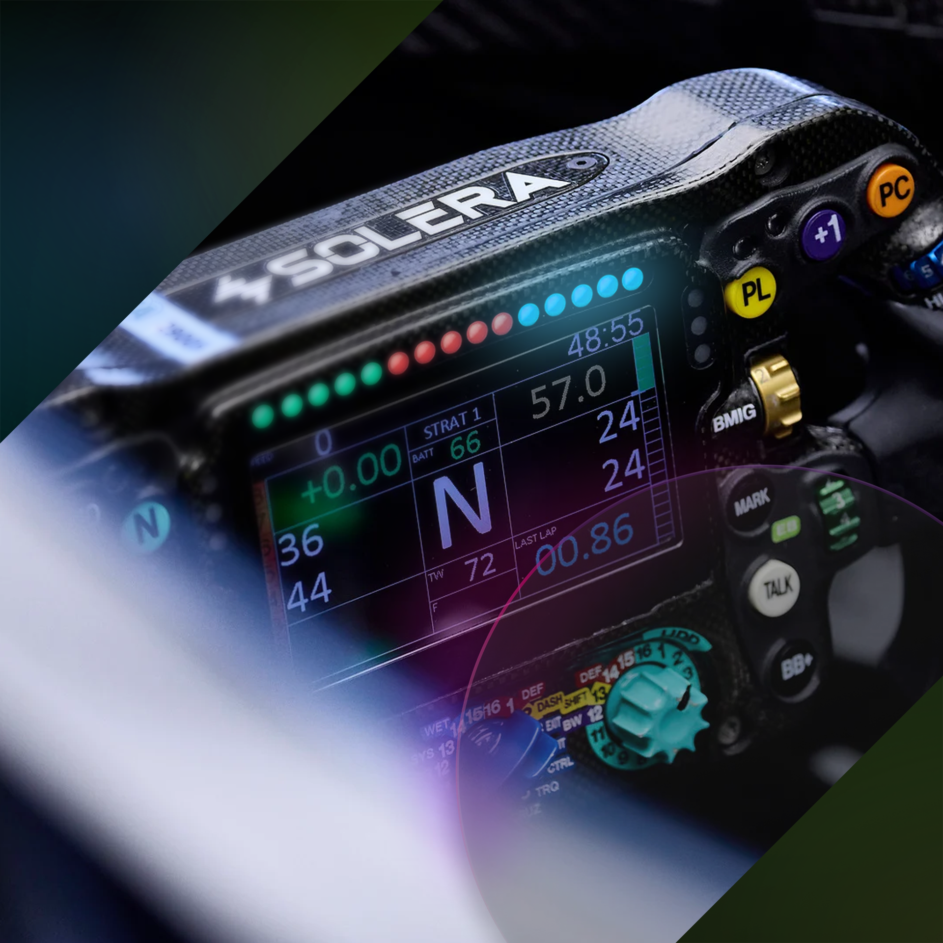
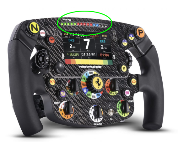
There are some notable exceptions when using colour to signal warnings or improve reaction times. As mentioned earlier, blue on black is not ideal for digital interfaces. However, when blue is introduced in the form of LEDs, the story changes. McLaren pioneered the modern Formula 1 steering wheel HMI (Human-Machine Interface), which was sold to many rival teams. Reaction times were proven to be fastest when responding to blue light, particularly across varying ambient light conditions. If you look at the shift light pattern on a Formula 1 steering wheel, you’ll see green, red, and then blue in order, alerting the driver to change gears.
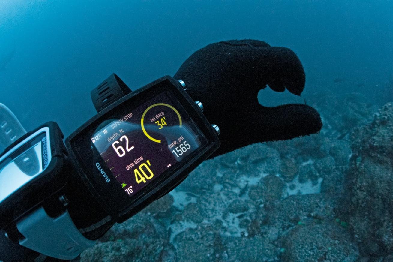
Finally, there’s a crucial use case where yellow light is the preferred choice for warnings and critical data: underwater. Because red light has the longest wavelength in the visible spectrum, it has lower energy and is absorbed first by water molecules. By around 5 meters (16 feet) deep, most red light disappears, followed by orange, and then yellow at even greater depths.

When designing interfaces for underwater use — whether for diving computers, watches, or submersibles — black, white, and yellow are the colours of choice.
Colour and light play a profound role in both nature and human-made systems, influencing perception, behaviour, and design choices. As technology continues to evolve, the principles of colour perception will remain crucial in shaping the way we interact with information.