The client
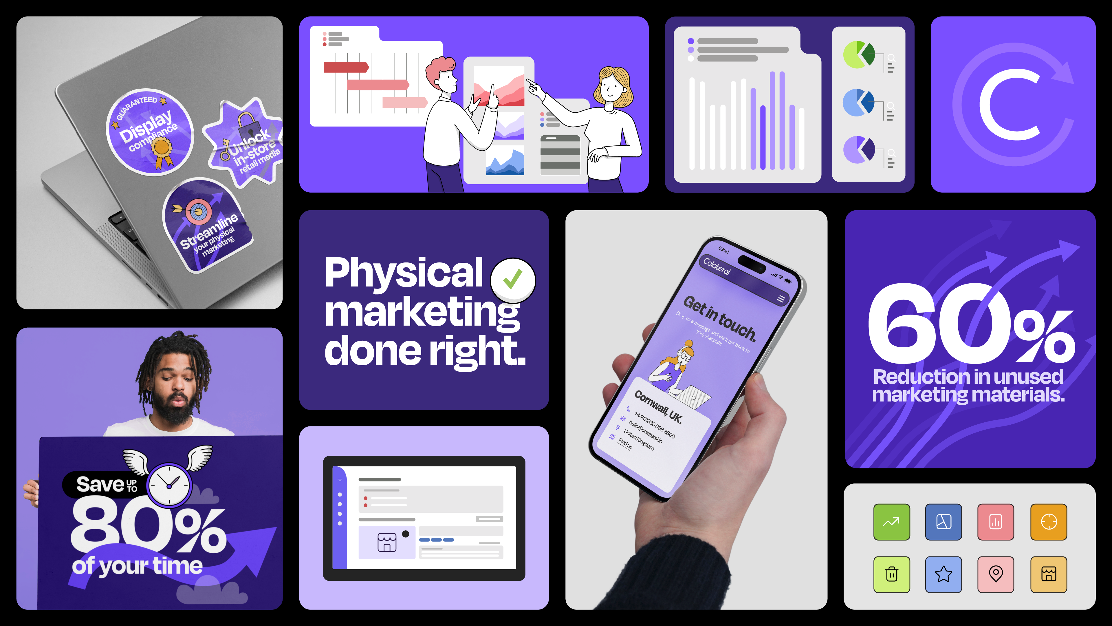
Colateral is a SAAS company that offers a software solution for managing physical marketing assets in retail estates. They wanted to modernise their brand and website, positioning themselves as the trusted go-to solution, and ultimately increase leads.
The brand workshop
To get an understanding of their business, Dawn conducted a collaborative workshop and formulated a strategy that aligned with their goals. This strategy sparked a theme of streamlining, and this was used to lead the decision making process across website planning and visual implementation.
How they did it
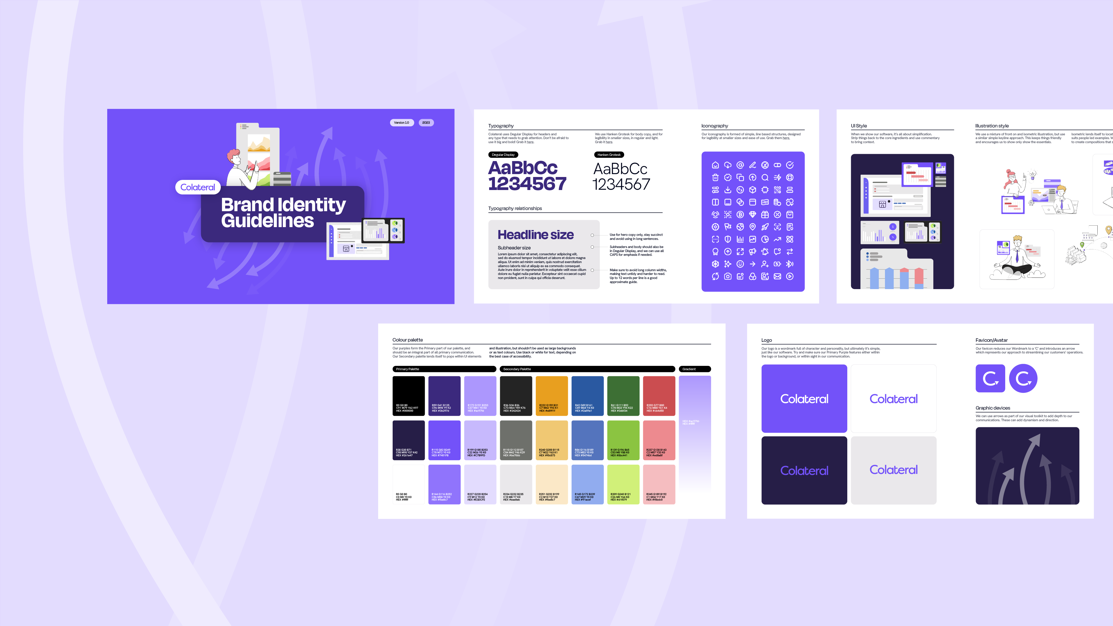
One of the first steps was to simplify the colour palette, which was diluting the brand and had become muddled in terms of usage. To remedy this, Dawn brought their signature purple back to the forefront and defined how a secondary palette should be used. Dawn also considered how this colour assignment would filter into the software itself, to create consistency across all touch points and help their users build familiarity.
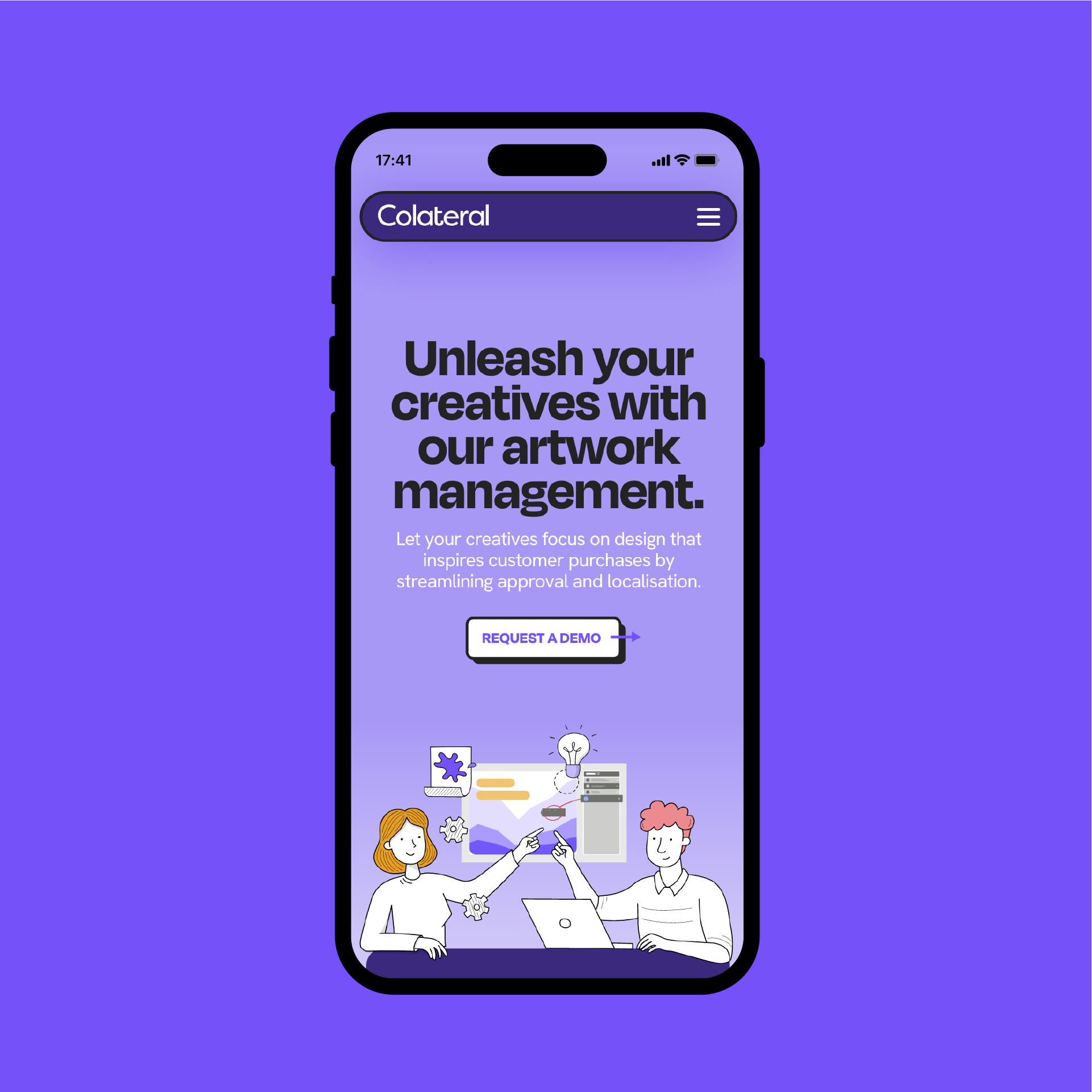
Another crucial element the agency focused on was making the brand elements feel more human; selling the "sizzle, not the sausage" by showcasing how the software could streamline processes and make work easier for its end users.
They introduced illustrations of people solving problems with the software, and crafted copy to avoid typical SAAS jargon and get straight to the heart of a user's pain points. Dawn built the illustration bank so it could be split into easily assembled components, allowing the Colateral team to self-serve and create endless variations for blogs, social assets or new features in the future.

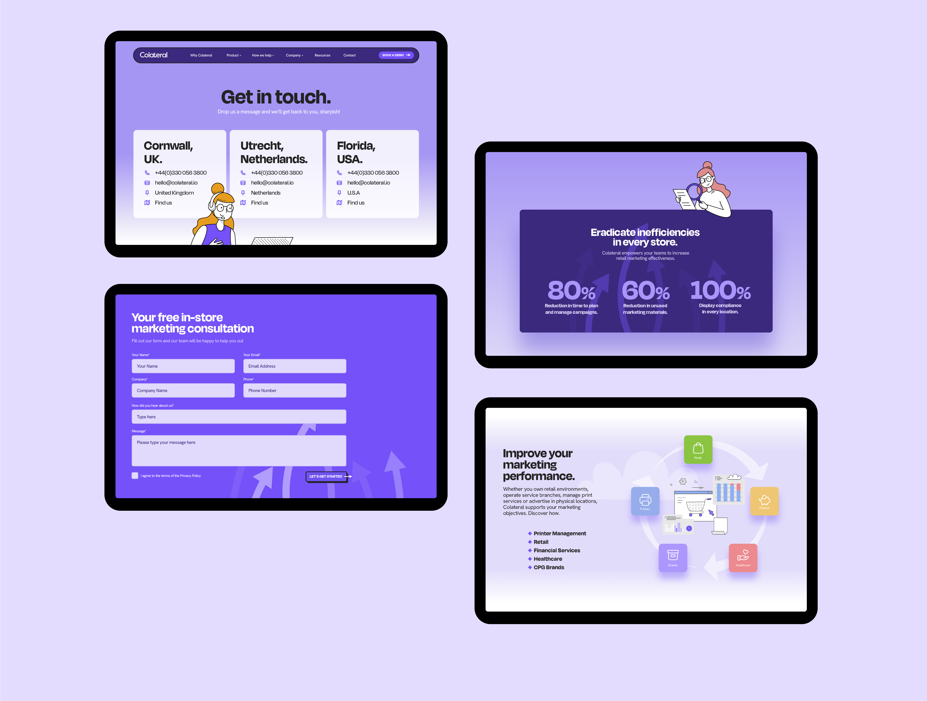
They tackled a number of technical website hurdles, with 2 sites required across the UK and US users, each with their own admin area. To achieve this, Wordpress multi-site was used, and they ensured that SEO wasn't compromised by adding hreflang tags and relevant language meta tags to each of the sites. They also installed browser language detection to redirect the user to the correct territory website.
On the website, the Dawn developers said:
"To make the website more user-friendly, we added a resource tagging system that allows users to filter by resource type and load more of the same resources. By removing the need to sift through content to find what a user needs, this ensured the site reflects the kind of business Colateral want to be - slick, easy, and time-saving.
We also added Hubspot form integration through APIs, so everything was in one place for a seamless experience. And to make things even better, the site is built to be fully editable for easy content updates, meaning as their software evolves, their site can follow".
 Colateral Marketing Manager Alex Knight added:
"Dawn Creative were great to work with. They really understood our proposition and where we wanted to go, and developed a visual identity that positioned us more professionally to the market. The process was really collaborative. And it felt like an extension of our internal team. We were in constant communication throughout, working closely to get design and build elements right. They were flexible to work to tight deadlines and complete work to a high standard. We're very happy with the finished result and I wouldn't hesitate to recommend them to others in the future."
