Considering that the average person spends hours a day on their phones, recent research by MRS, Dynata, Kantar, Lucid and Toluna revealed that almost a third ( 30%) of surveys globally restrict respondents to a desktop experience only, and 20-25% of surveys did not allow phones at all.
The findings, which were displayed in this article by Research Live, were absolutely shocking - that, in 2020 companies are still restricting respondents based on what device they use and are impeding the research industry as a result.
We believe that all surveys should have the ability to be completed on a desktop or mobile device. But not only this, that the mobile experience be seamless and user-friendly, in turn limiting the amount of respondents who might abandon filling it out on mobile.
Courtney Williams, Executive Director of Quality at Lucid commented within the article that ““Research design that does not fully result in a mobile-friendly experience is often the culprit behind resulting non-representative audiences and feasibility challenges.”
Indeed, it’s baffling to us that mobile-friendly experiences are still not viewed as the norm across the entire market research industry.
We firmly believe that market research agencies have a responsibility to their clients and the industry as a whole to look at their surveys and say, what can we do better to ensure our surveys are responsive on mobile?
Mobile-friendly surveys should be beautiful to look at - but more importantly, beautiful to use
We have always understood the importance of creating mobile-friendly surveys to ensure that our surveys are accessible to all. Every one of our surveys, regardless of their format, has been built to ensure they are beautiful to look at but more importantly, beautiful to use.
The Research Live article states that “In terms of improving usability, mobile surveys should have bigger functional objects and buttons to make surveys easier to use, fewer images and fewer words.” but these suggestions are only just scratching the surface.
In order for mobile surveys to keep respondents engaged, they need to go above and beyond just having fewer images and fewer words. Agencies need to look at their mobile surveys with a critical eye and say, how can we do better? How can we make sure this experience is seamless from start to finish?
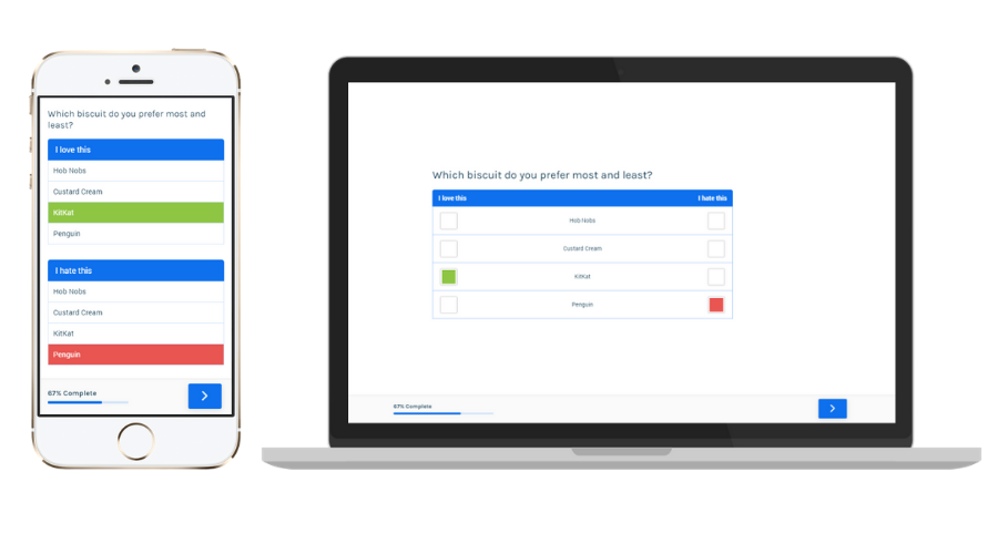
For example, all of our surveys are designed to adjust to whatever screen size someone’s mobile device is. Similarly, earlier this year we went even further and completely changed one of our item types, MostLeast.
Instead of MostLeast just being responsive, it's now completely different on mobile. We’ve developed different HTML markup which is better optimised for touch screens and if the browser is resized to desktop size, it will swap to the desktop version whilst still keeping the response data intact.

Whilst these kinds of updates of course take time and skill, it’s essential to making sure we excel at what we do - in turn, giving the best possible service to our clients and making sure our audiences are always representative.
Get in touch
We’re on a mission to give you the smartest all-round operations support for your market research. It’s what we do best.
No nonsense. No jargon. Just brilliant surveys for brighter insights.
If you’re curious about what we do and would like to get in touch, we’d love to hear from you.
Visit our website, call +44[0]844 974 5010 or email hello@omnisis.co.uk where a senior member of the team will get back to you as soon as possible.


